

3D按钮效果
- 案例名称:土星圆环案例
- 案例人员:杨标
- 案例平台:HTML+CSS
- 完成时间:2019年8月31日
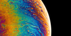
效果图

案例说明
本案例旨在对学生的基本效果的了解,通过案例,让学生对a标签与button标签的伪类:active的效果的使用,同时对阴影以及文字阴影及transform属性的掌握
案例代码
<!DOCTYPE html>
<html lang="en">
<head>
   <meta charset="UTF-8">
   <meta name="viewport" content="width=device-width, initial-scale=1.0">
   <meta http-equiv="X-UA-Compatible" content="ie=edge">
   <title>3D按钮效果</title>
   <style>
       .btn1{
           border: none;
           background-color: lightseagreen;
           font-size: 26px;
           padding: 10px 10px;
           border-radius: 0.3em;
           text-shadow: 2px 2px 2px gray;
           box-shadow: 2px 2px 0px #048079;
           outline:none ;
           cursor: pointer;
       }
       .btn1:active{
           transform: translate(4px,4px);
           box-shadow: none;
       }
   </style>
</head>
<body>
   <button type="button" class="btn1">button1</button>
</body>
</html>
评论区