

雷达图案例
- 案例名称:雷达案例
- 案例人员:杨标
- 案例平台:HTML+CSS
- 完成时间:2022年2月16日
效果图
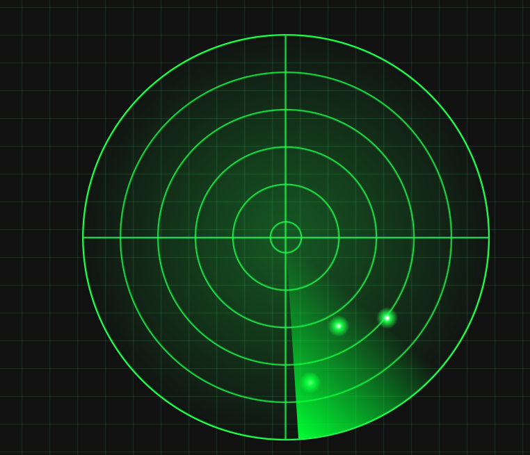
案例说明
本案例指在对学生的CSS渐变做一个综合练习,同时对基本的布局也做一个练习回顾
案例代码
<!DOCTYPE html>
<html>
	<head>
		<meta charset="utf-8">
		<title>雷达图</title>
		<style type="text/css">
			* {
				margin: 0;
				padding: 0;
				list-style-type: none;
			}

			html,
			body {
				width: 100%;
				height: 100%;
			}

			body {
				background-color: black;
				background-image: repeating-linear-gradient(to right, rgba(0, 0, 0, 0) 0%, 2%, rgba(24, 138, 65, 0.3) 2% 2.1%),
					repeating-linear-gradient(to top, rgba(0, 0, 0, 0) 0%, 3%, rgba(24, 138, 65, 0.3) 3% 3.1%);
			}

			.box {
				zoom: 2;
				width: 400px;
				height: 400px;
				border: 1px solid #20ff4d;
				position: fixed;
				left: 0px;
				right: 0px;
				top: 0px;
				bottom: 0px;
				margin: auto;
				border-radius: 50%;
				background-image: radial-gradient(rgba(32, 255, 77, 0.3) 0%, rgba(32, 255, 77, 0) 75%),
					repeating-radial-gradient(transparent 0% 18%, rgba(32, 255, 77, 0.8) 18% 18.4%),
					linear-gradient(to top, transparent 0% 49.5%, rgba(32, 255, 77, 0.8) 49.9% 50.1%, transparent 50.1% 100%),
					linear-gradient(to right, transparent 0% 49.5%, rgba(32, 255, 77, 0.8) 49.9% 50.1%, transparent 50.1% 100%);
			}
			.small-box{
				width: 100%;
				height: 100%;
				border-radius: 50%;
				background-image: conic-gradient(transparent 0% 85%,rgba(32, 255, 77, 0.8));
				animation: small-box-ani 10s linear infinite;
			}
			@keyframes small-box-ani{
				to{
					transform: rotateZ(1turn);
				}
			}
			.small-circle{
				position: absolute;
				width: 1px;
				height: 1px;
				background-color: rgba(32, 255, 77, 0.8);
				box-shadow: 0px 0px 15px 10px rgba(32, 255, 77, 1);
				border-radius: 50%;
				animation: ani2 10s linear infinite;
			}
			.s1{
				right: 180px;
				bottom: 20px;
				animation-delay: 1s;
			}
			.s2{
				right: 100px;
				bottom: 50px;
			}
			.s3{
				right: 150px;
				bottom: 120px;
			}
			@keyframes ani2{
				0%,41%{
					opacity: 0;
					transform: scale(0.8);
				}
				50%,90%{
					opacity: 1;
					transform: scale(1);
				}
				100%{
					opacity: 0;
					transform: scale(0.8);
				}
			}
		</style>
	</head>
	<body>
		<div class="box">
			<div class="small-box"></div>
			<div class="small-circle s1"></div>
			<div class="small-circle s2"></div>
			<div class="small-circle s3"></div>
		</div>
	</body>
</html>
评论区