

土星圆环案例
- 案例名称:土星圆环案例
- 案例人员:杨标
- 案例平台:HTML+CSS
- 完成时间:2019年8月31日
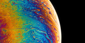
效果图

案例说明
本案例旨在对学生的HTML及CSS的布局做一个练习,同时要掌握基本的流式布局与定位,以及CSS3的动画与变幻等效果,对渐变的使用圆锥渐变有一个补充
案例代码
<!DOCTYPE html>
<html lang="en">
<head>
    <meta charset="UTF-8">
    <meta name="viewport" content="width=device-width, initial-scale=1.0">
    <meta http-equiv="X-UA-Compatible" content="ie=edge">
    <title>土星效果</title>
    <style>
        body{
            background-color: #000000;
        }
        .outBox{
            width: 200px;
            height: 200px;
            position: relative;
        }
        .huan{
            width: 200px;
            height: 200px;
            background: conic-gradient(red,blue,lightgreen,red);
            border-radius: 50%;
            transform: rotateX(100deg) rotateY(15deg);
            animation: zhuan 5s linear infinite;
        }
        /*添加一个动画效果,例其沿着Z轴进行旋转*/
        @keyframes zhuan{
            to{
                transform: rotateX(100deg) rotateY(15deg) rotateZ(360deg);
            }
        }
        .huan::before{
            background-color: #000000;
            width: 150px;
            height: 150px;
            border-radius: 50%;
            display: block;
            content: "";
            transform: translate(25px,25px);

        }
        .circle{
            width: 100px;
            height: 100px;
            background-color:rgba(0, 0, 0, 0.1);
            position: absolute;
            left: 50%;
            top: 50%;
            transform:translate(-50%,-50%);
            border-radius: 50%;
            box-shadow: 0px 0px 15px 3px deeppink inset;
        }
    </style>
</head>
<body>
    <div class="outBox">
        <div class="huan"></div>
        <div class="circle"></div>
    </div>
</body>
</html>
第一个divoutBox我们是用于制作圆环,第二个divcircle我们是用于制用球,同时在CSS里面,我们使用after的伪元素,实现了外边的环
评论区